I stumbled on the Gimp Brainstorming blog here, and I have to say, I'm impressed. The concept is simple:
This is a visual brainstorm, the channel for everybody to contribute to the GIMP UI redesign process. It is moderated by the GIMP UI redesign team, consisting of professional interaction and usability specialists. We do not post mock-ups here ourselves, we ‘listen’ to what you show us and broaden our horizons.
The rules provided a pretty strict - submit an image of your recommendation. Feel free to annotate the image however you'd like, just so long as it's clear. No text, not even the submitter's name, is included in the blog. It's just photos.
Simple and quite powerful. It works as brainstorming, as there's no judgment being passed on the idea, and the playing field is quite level - everyone has the same image space to work with.
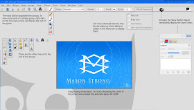
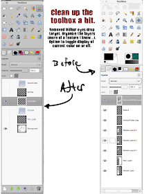
Clever stuff. Here are two examples to give you a flavor for the site:


No comments:
Post a Comment