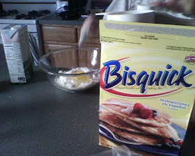
We busted out the waffle maker and Bisquick for a real Sunday breakfast. Even though we hadn't used the waffle maker in some time, the waffles still came out perfect. I attribute this to both Shira's cooking skills, and the waffle maker's UI.
Our waffle maker is the Macintosh mouse of kitchen appliances. It has a single light which represents the entire UI. No knobs, LCDs or dashboards. Just a light.
Plug in the waffle maker, light comes on telling you it's alive. Then it goes off when it's ready for use. You add batter, and the light comes on again. When the light goes off, it's time to eat.
I'm sure marketing was annoyed that the whole UI was driven by a single yellow lamp. But where's the color LCD? And what about the built in timer/radio, that our competitor has? Fortunately, elegant engineering won out here, and I had perfectly cooked waffles this morning without needing to consult a manual.
Lesson of the day - prefer simplicity and Doing The Right Thing over feature lists. Bonus lesson: add whip cream whenever possible.
For the record - the sausage links in the photo are Morning Star farms veggie sausage - very yummy stuff.
--Ben


No comments:
Post a Comment